Case Study.
Creating the BT Digital Design Language
How it started
With BT unveiling its new brand, there was a need to redesign the digital estate. The brand agency had done a great job of creating a new marque and a philosophy for the brand. The emphasis was on the high level, broad strokes of the BT brand, not at the level of detail we would need for our designers to incorporate it consistently, in digital.
What we needed was a design language.
Working with the BT brand team and the brand agency, we discussed exploring the fonts, colour accessibility and how to give meaning, within digital, to some of the brand elements. We brought together a small group of keen product designers and our accessibility specialist to work through initial ideas. The outcome of this was a set of possible themes that could guide further thinking. This process took a few weeks to pull together, but it set us up to bring more designers of all disciplines into the thought process. After all, these are the people who will be using the brand day to day and it was important that everyone felt some ownership of the creative process.
The next step was to organise a Hack Day. We thought this was the best way to get as many people as possible immersed in the brand and to generate lots of ideas quickly.
New High Level Brand Assets
Colour palette

The Portal - energy

The Portal as a branding device on imagery

Illustration style
Energy stylised illustration

Hack Day
Agenda
Day 1
9:00 Arrive
9:10 Intro
9:30. Get into your team and explore
12:30 Break for lunch
13:30 Continue creative exploration
16:00 Playback
Day 2
10.00 Dot voting
10.20 Next steps
We brought together over 30 product and content designers from BT, EE and Plusnet for a 2 day hack.
Across day one we arranged the designers into small, cross-discipline, multi-brand teams. Each team had the day to work on breaking the current guidelines and using everything we had gathered around the new branding for digital to create a fresh new BT.com. They were given the themes from our initial work with BT brand and the brand agency and some possible approaches they could take.
We had a playback session at the end of the day where each team walked everyone through their ideas.
Day two was a session to bring the previous day’s thinking together. We began with a dot voting session. Each designer could place a dot on up to 5 ideas or pieces of work. As a group, we then discussed the dot groupings, the merits of ideas, how they might be taken forward.
The next steps were for the design managers to gather all the exploration, comments and ideas together and create a more focused direction for a phase 2.
Phase 1 themes
Simpler, bolder typography
Telling stories through content flow
Bolder use of colour
Keep content simple and concise
Better use of video and animation
Button style change (similar thinking across the teams)
Curves, circles as graphic devices
Softer edges
Product centre of focus
Meaningful imagery
Possible Approach
Fluid
Minimal, clean and beautiful
Dynamic
Hard hitting
Unexpected
Futuristic
Warm and welcoming
Photos from day one of the teams’ playback of their work

Some of the creative output from the day


Phase 2 in lockdown
After looking at the creative exploration in the playback and dot voting by everyone involved, we started to notice similar themes. This helped with grouping certain areas of focus, but before we could organise a second session, the Covid-19 Pandemic hit.
Some momentum was lost due to this and we had to find new ways to collaborate remotely and drive the Design Language to completion.
Regroup
The digital team quickly shifted to using realtime collaboration tools like Miro and this rapidly became the new way of working for the design team. We created a Microsoft Teams group with breakout rooms so everyone could discuss specific topics under the umbrella of the DDL exploration.
Using a smaller group of designers we replayed the grouping from the initial hack day and shared areas where more exploration could be done. This time round we paired the designers according to how we felt the best outcomes could be achieved.
Areas of exploration
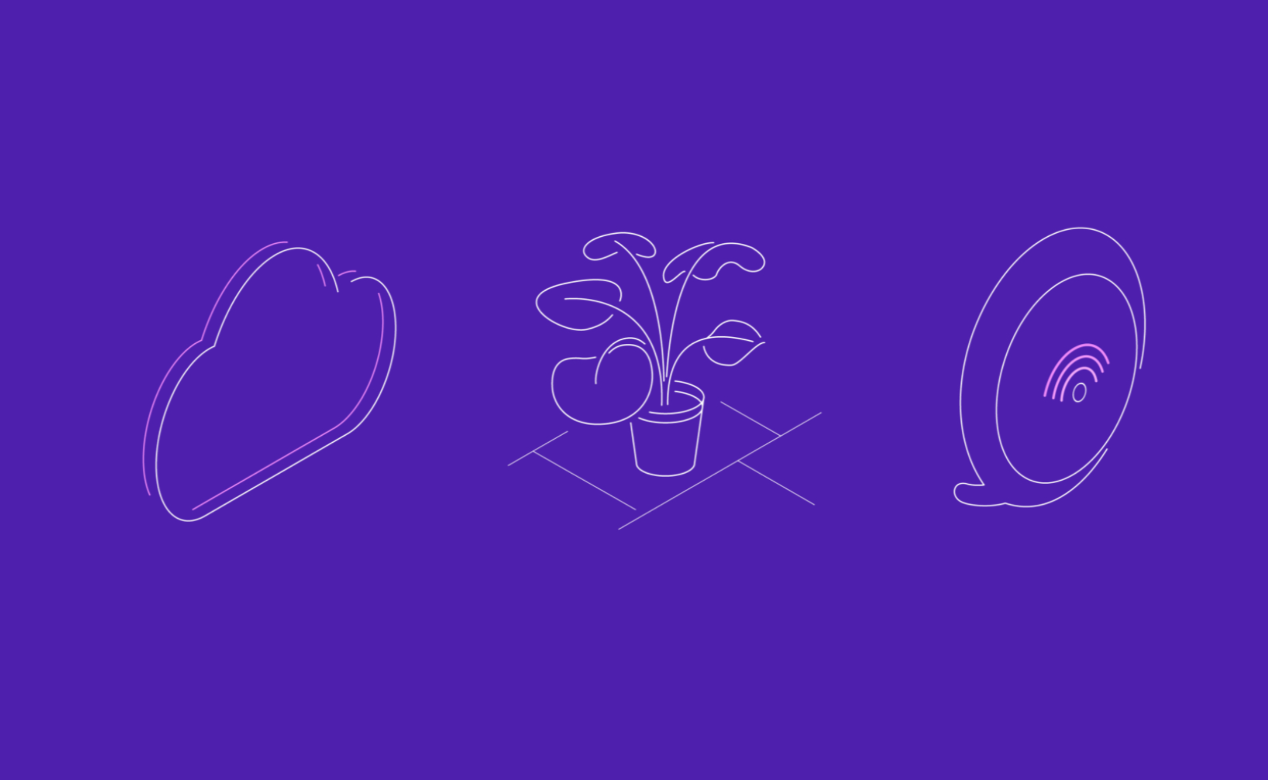
How we can use the “pink energy” from the portal more effectively
Micro-interactions
Working with more space and depth
Typography
Use of pink energy and typography
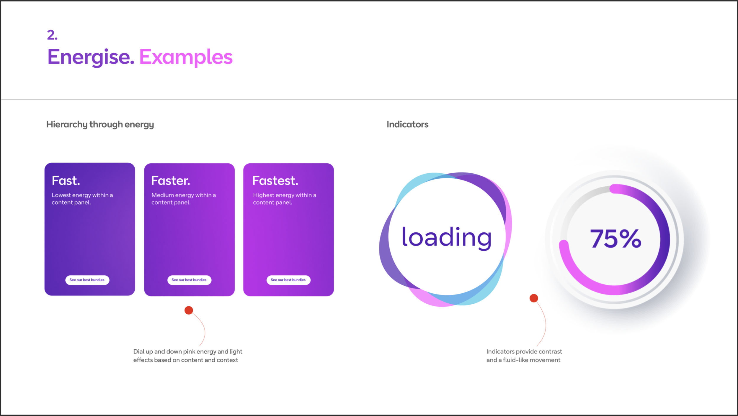
Two areas that came out of the Hack Day were the use of Pink Energy and Typography.
From the branding work there was the ability to show different intensities of energy. So we explored whether the intensity was related to the point in a user’s journey or the type of product being viewed.
Previously, BT suffered from not having flexible or impactful type heirarchy. The consensus was that we needed something big and bold to give the designers more scope for creativity and to give BT a personality.

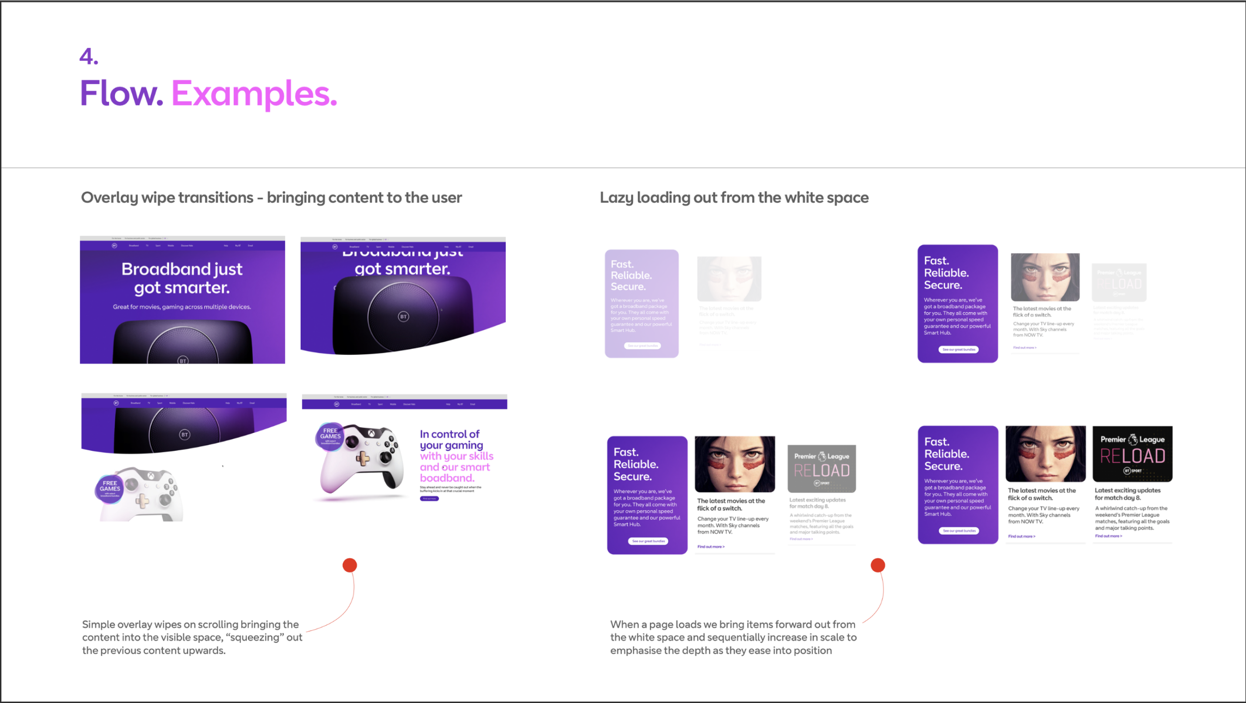
Use of space and depth
Two other areas we really wanted to explore were how we could use space and depth. The idea was that giving content space to breathe would help users consume the content. Using depth techniques would create hierarchy by bringing elements forward or sending them back on the page. Combining these approaches could aid in telling stories and guiding users through the content.


Bringing it all together
After a few more sessions with a smaller working group, the Design Language was starting to take shape. We worked closely with the BT brand team, having regular check ins with them to share the progress and get brand adoption.
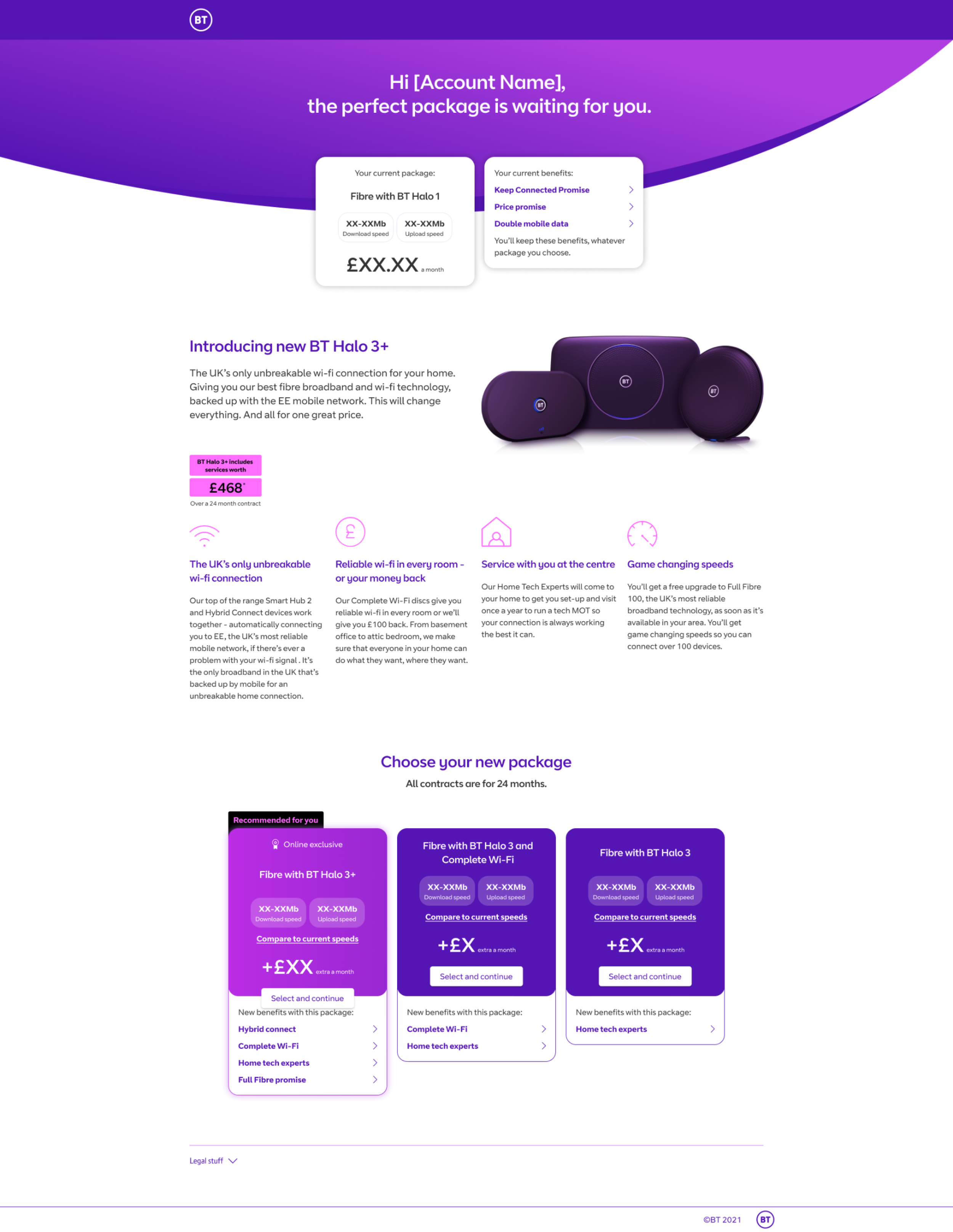
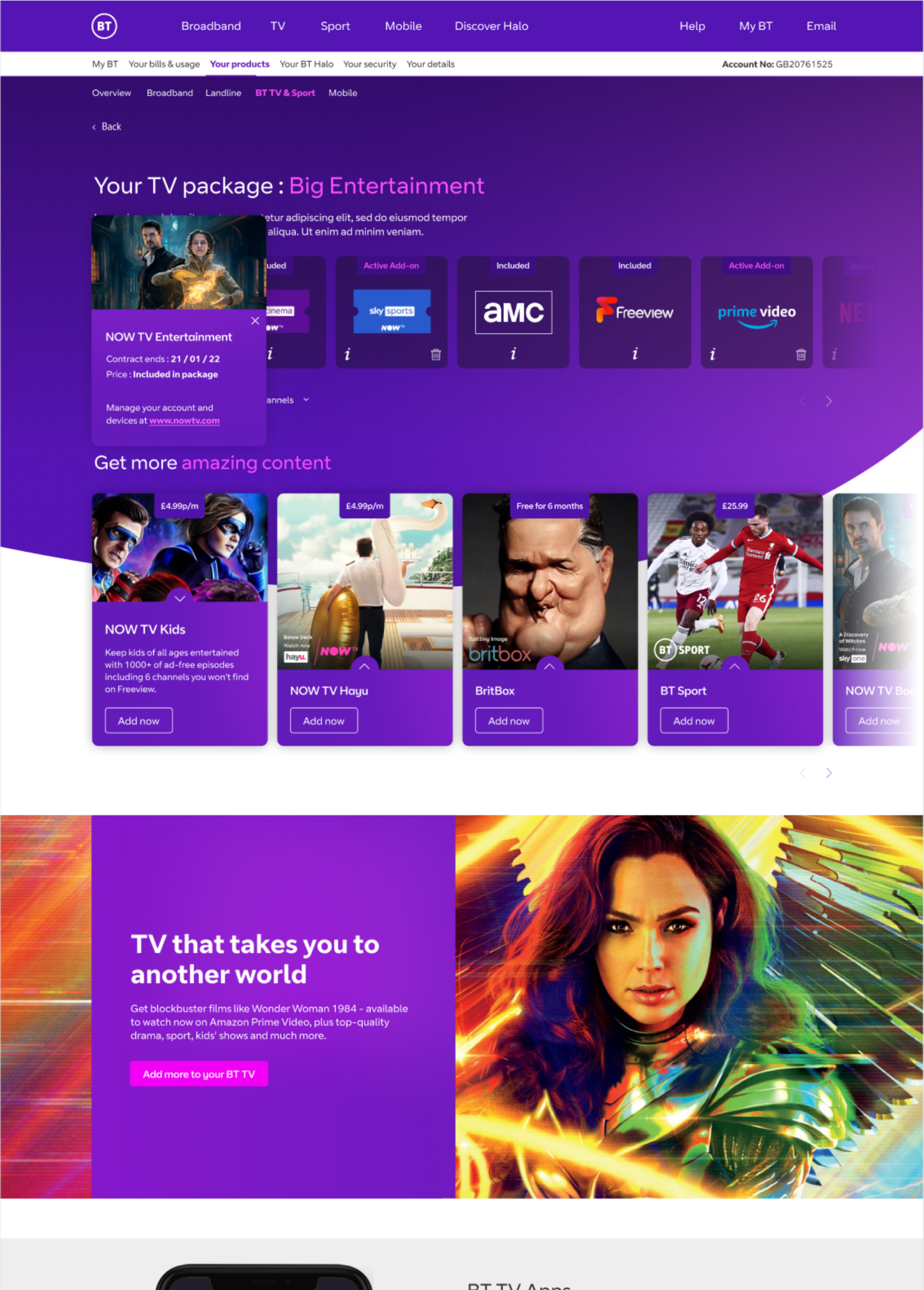
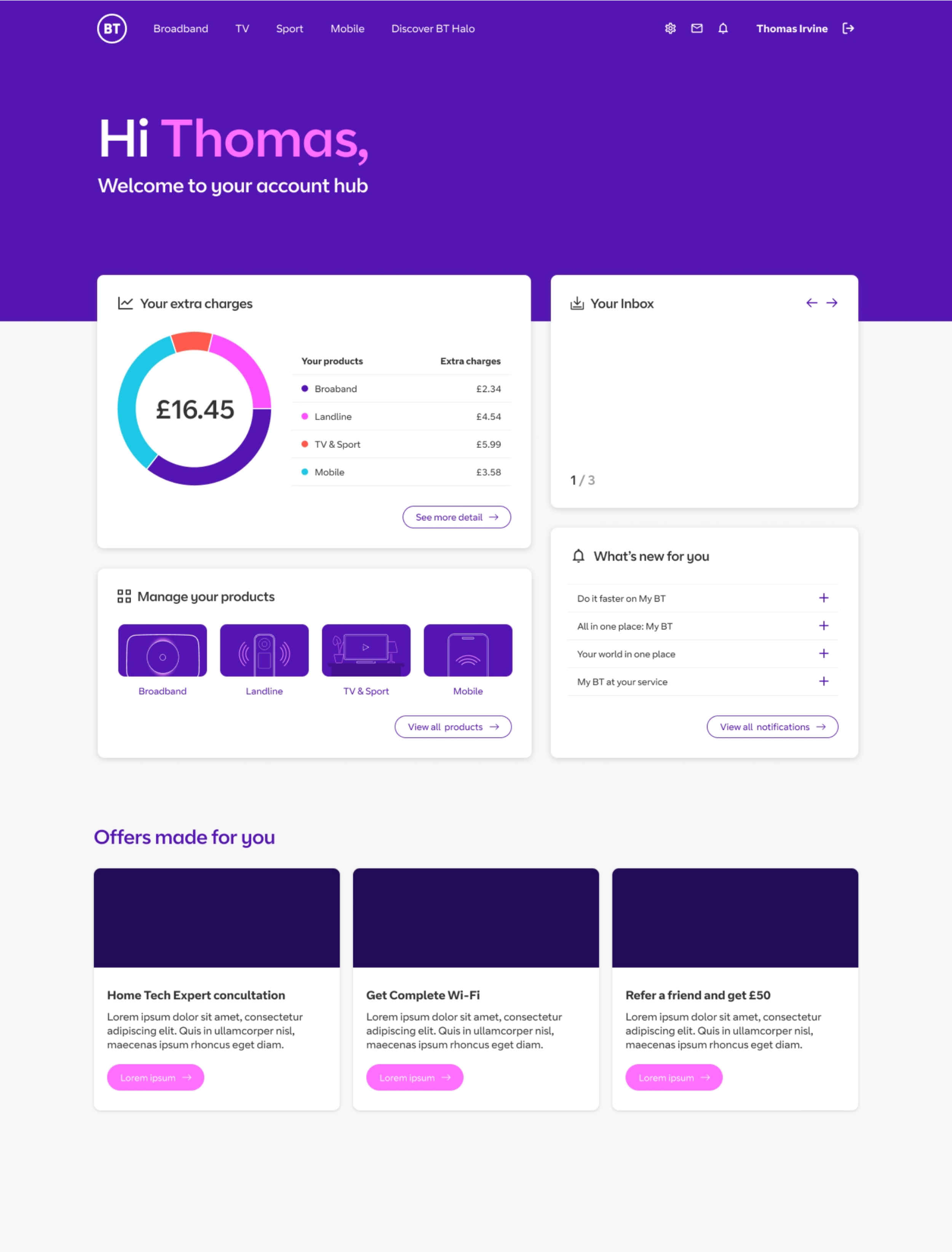
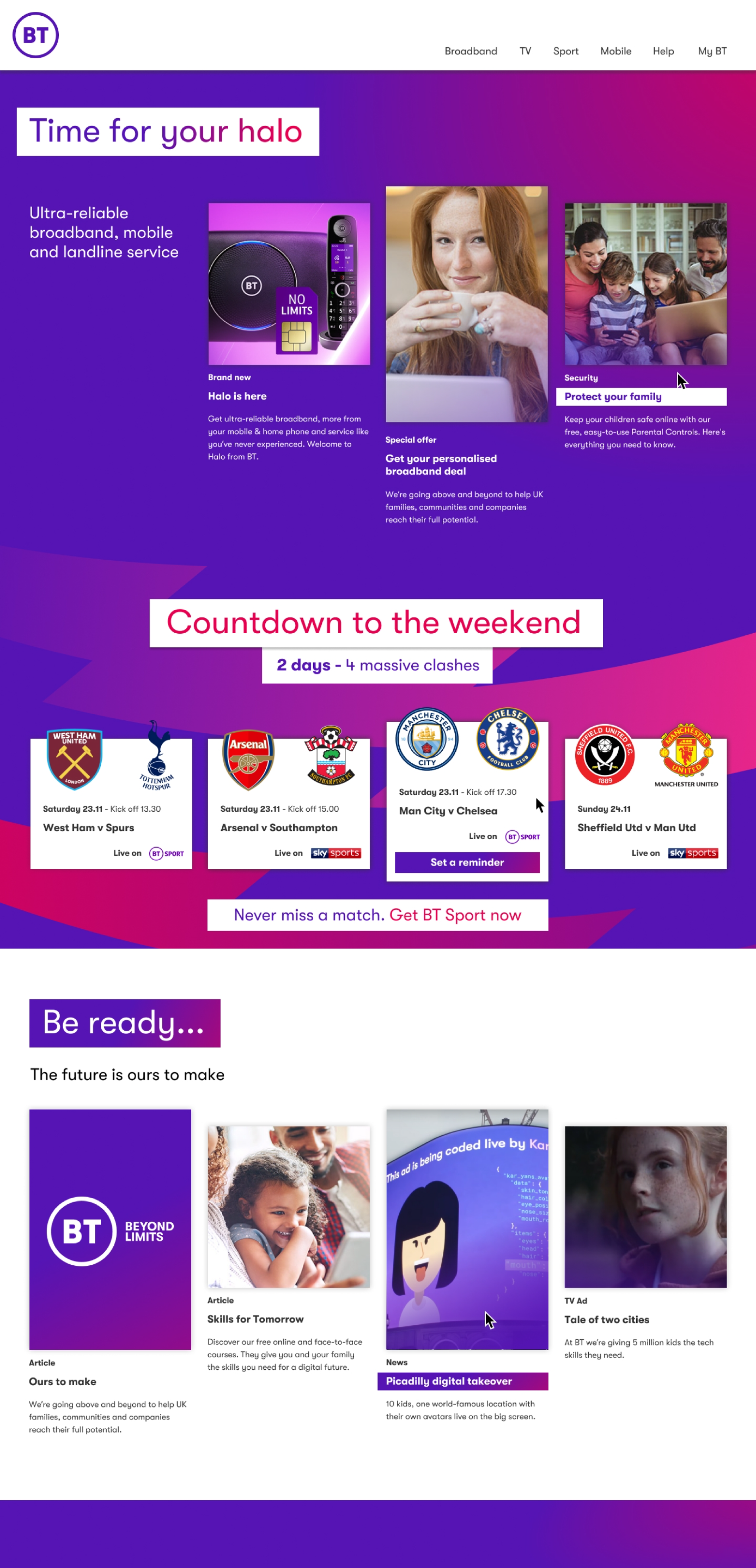
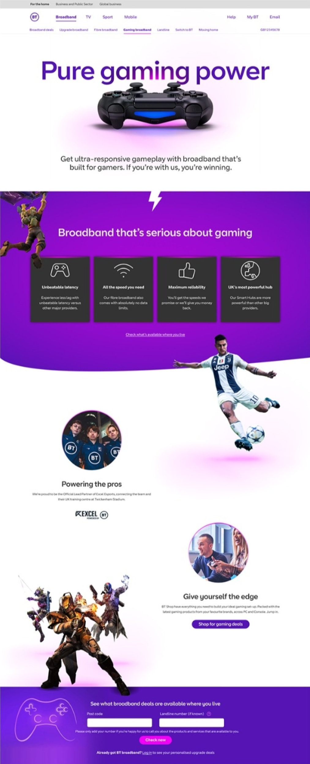
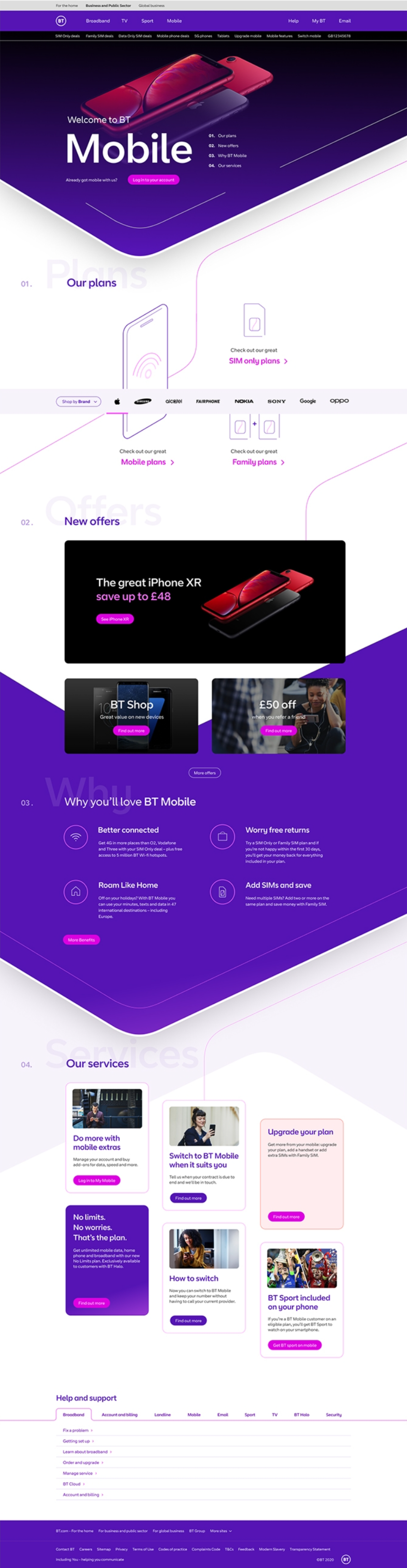
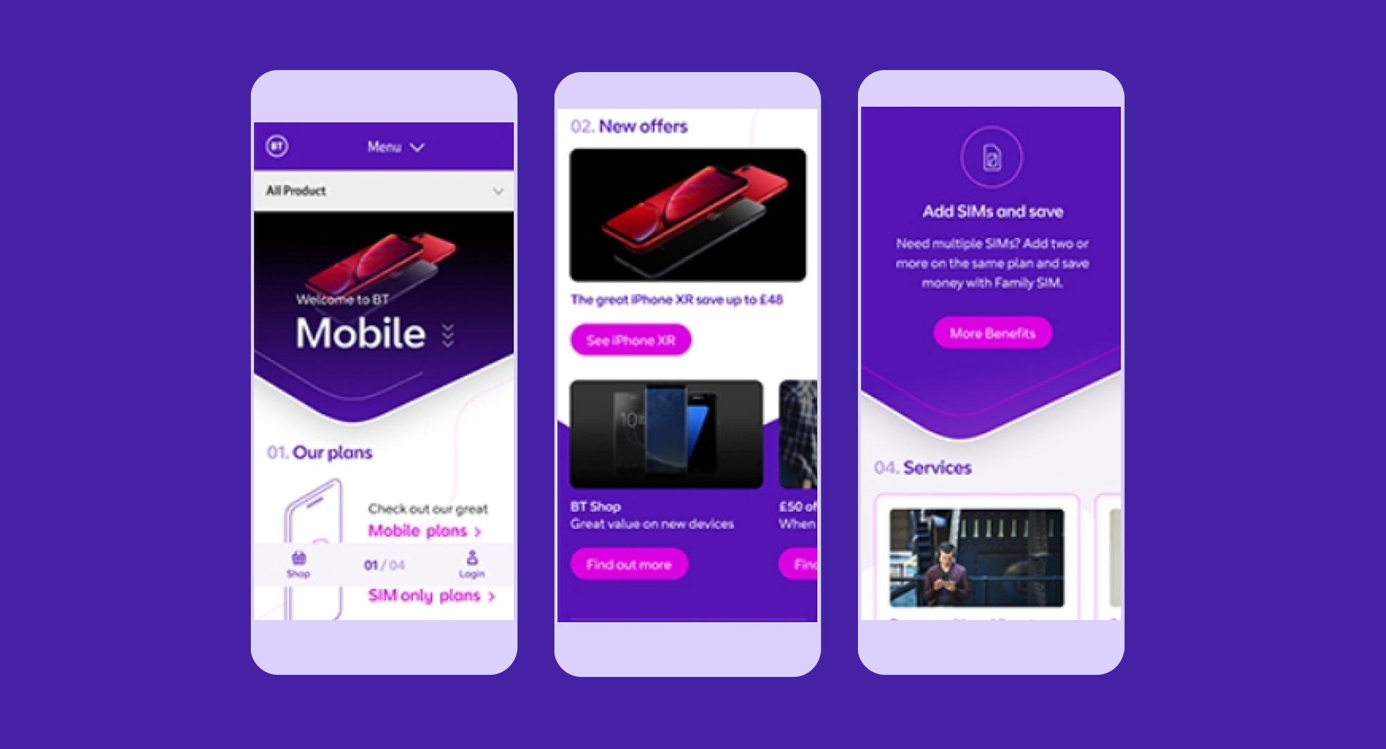
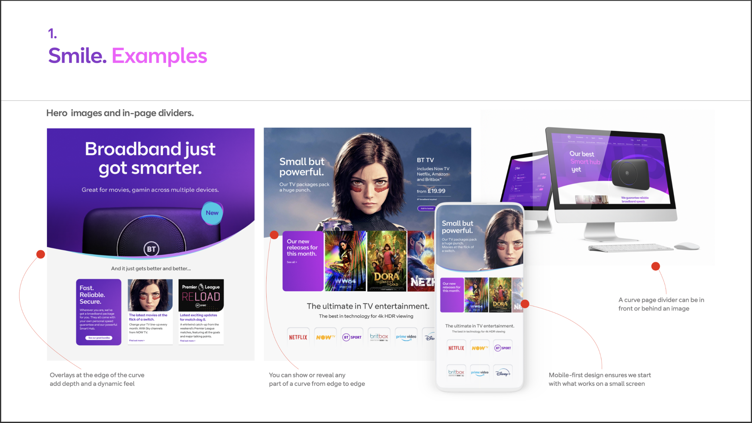
An overarching motif was the power of the portal, its movement and intensity. This gave us a clear direction for the focus areas for the design language. Leaning on the expertise of our content design team, we arrived at 4 pillars of the language: Smile, Energise, Breathe, and Flow.
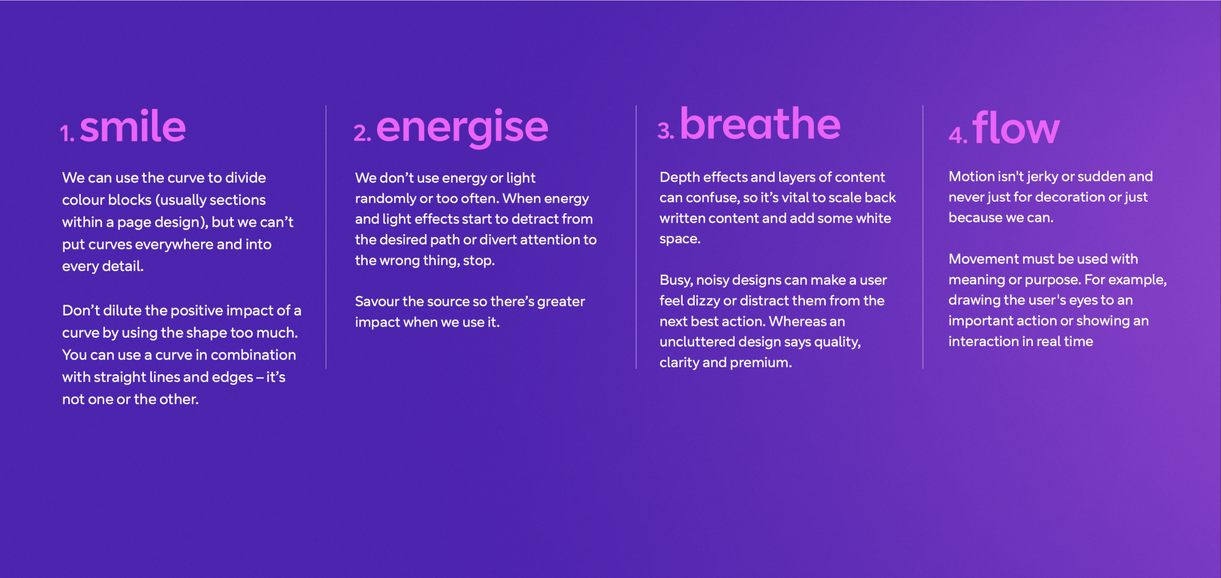
Now that the 4 pillars for the Design Language were defined, we documented examples that could inspire the team and guide future creativity. Below are some pages from our Digital Design Language Guide.


Launch, governance and beyond
With a design team of 160+ designers, we couldn’t just launch the Digital Design Language and leave the team to it. We needed a roll out, governance and adoption.
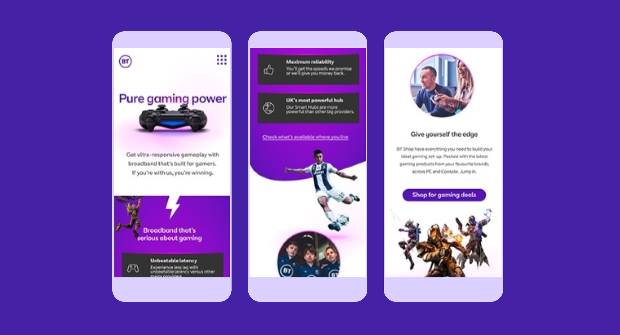
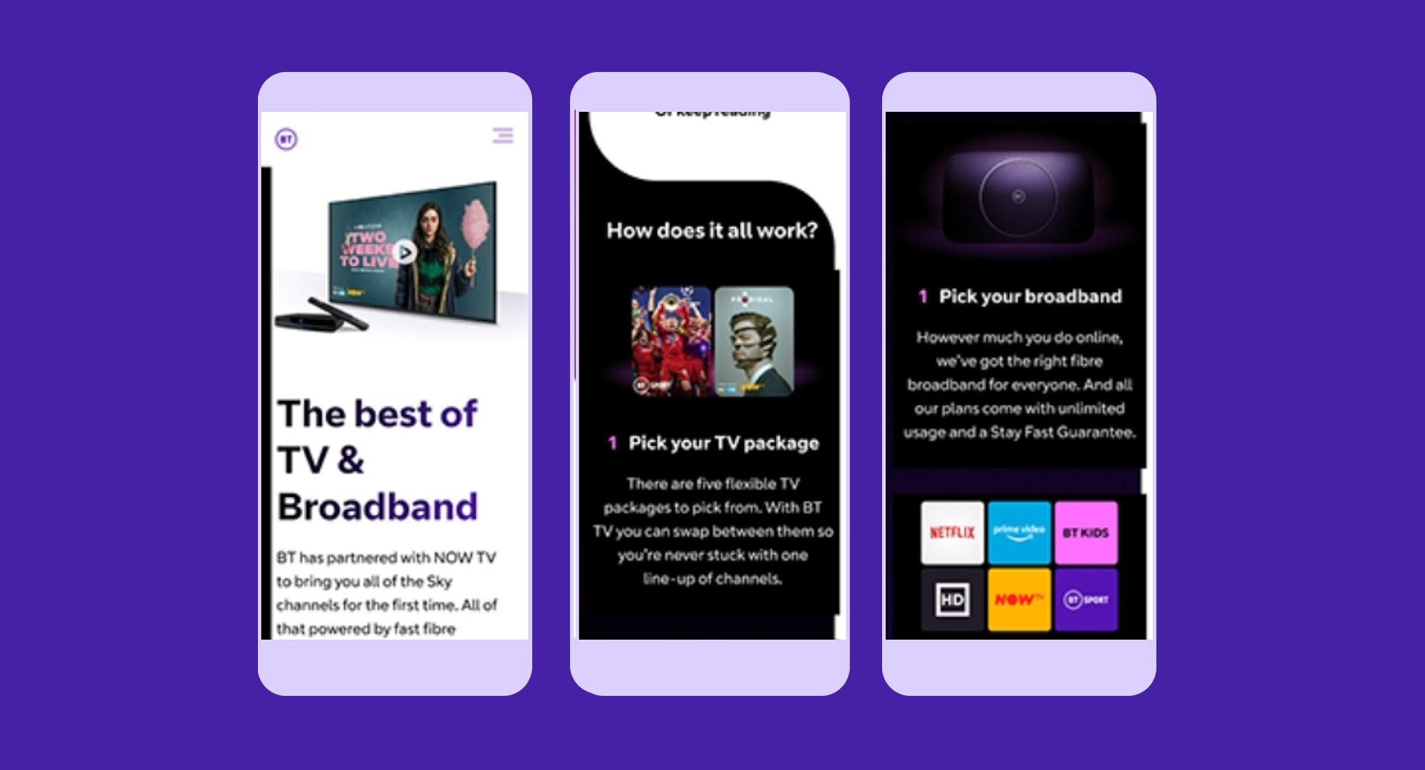
We started by trialing the DDL with 6 squads, each focusing on different areas of the customer lifecycle. This gave them the ability to flex the four expressions within their current projects.
To capture any learnings from these squads, we created an area in Figma where each expression had its own section. Each section had a 'playground area' to share what people had done that was being tested, but also an area showing the tested creative and how it had been used.
Every Friday, we had a catch up with the squads to see progress on how things we're being done and share ideas. These were then tested in the labs against their current experiences, iterated upon and pushed live.
The Friday catch ups evolved as the roll out to more squads increased. It became a drop-in session with the senior design managers and the brand team always attending. Any and all designers using the DDL could dial in to the call (we were still in lockdowns at this point) and show work at any stage of development or if they were experiencing blockers. As a leadership team we committed to make sure we ended the session with decisions that the designers could take away and act on. There were no questions on the call left without an answer.
It was very effective in rolling out the DDL to the whole team, but it was also a great way to have a relaxed Friday afternoon catching up with colleagues and talking about design. It was great to see designers who were not involved in the initial small scale roll out, picking up design cues and engaging in the later sessions. There was a kind of tipping point where the majority of new creative work was naturally using the DDL. At this point we could see the roll out was a success. It had the added bonus of creating new collaboration across squads from different alliances, which only enhanced the consistency of design.
The DDL is only part of a larger design framework, which incorporates the BT Loop Design System and the overarching BT brand. These have to feed both our Consumer department as well as BT Enterprise and the wider BT Group.